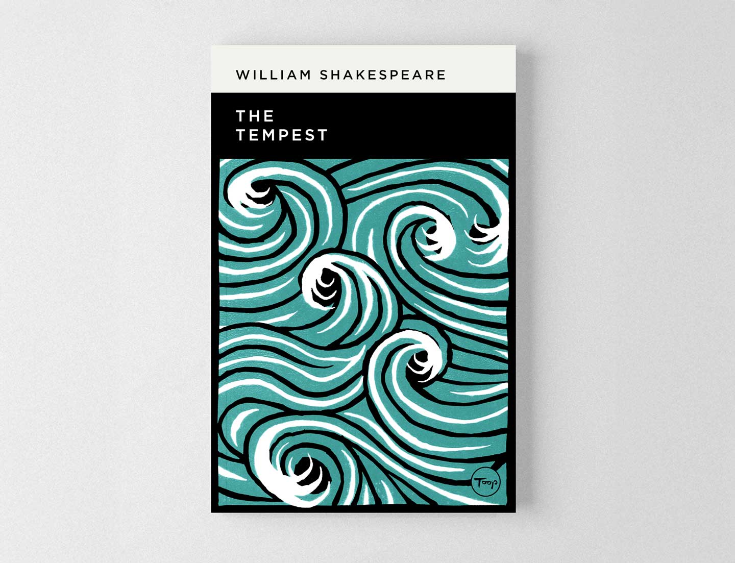
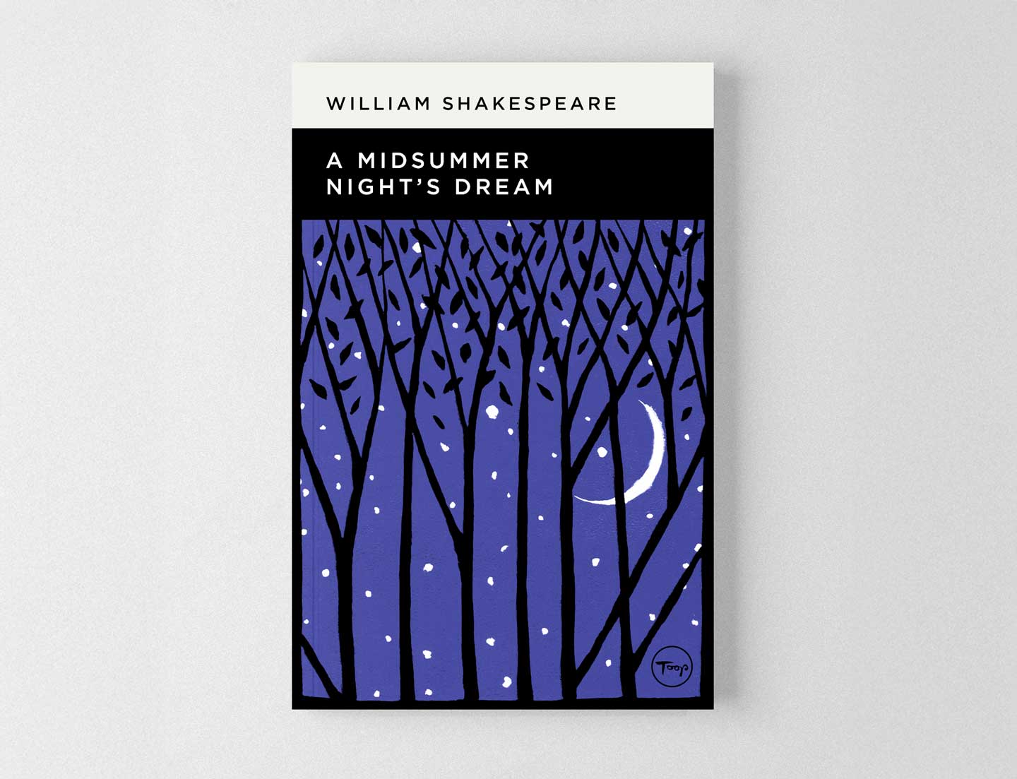
I recently began experimenting with the linocut printing process. During a quiet week after Christmas, I used these skills to design a set of book covers. I chose three Shakespeare plays—The Tempest, A Midsummer Night’s Dream, and Macbeth—precisely because they have been reinterpreted so often. The challenge was to bring something fresh yet timeless to Shakespeare Book Cover Designs. As this was a personal project, I set my own brief. The use of linocuts was a given, as their carved aesthetic naturally enforces simplicity. This limitation was a welcome creative challenge. I also restricted my colour palette to one main colour plus black and white for each cover. For typography, I opted for a simple modernist font and a structured grid to give the covers a timeless quality. My goal was to distil the essence of each play into a bold, pattern-driven graphic style—free from clutter or direct character depictions. Instead, I focused on setting and key motifs: a stormy ocean (The Tempest), a moonlit forest (A Midsummer Night’s Dream), and a floating bloody dagger (Macbeth). This approach gave the Shakespeare Book Cover Designs a distinct, minimalist identity. Next time I have a quiet week, I plan to expand this collection. I also intend to reimagine new book covers for other classic novels. Shadric Toop Book Jacket Design – A Guide to the Good Life School wall graphic – Top 100 books – English department – Wellington Academy
Shakespeare Book Cover Designs


Shakespeare Book Cover Designs
The Designs
The Project Outcome
Next Steps

