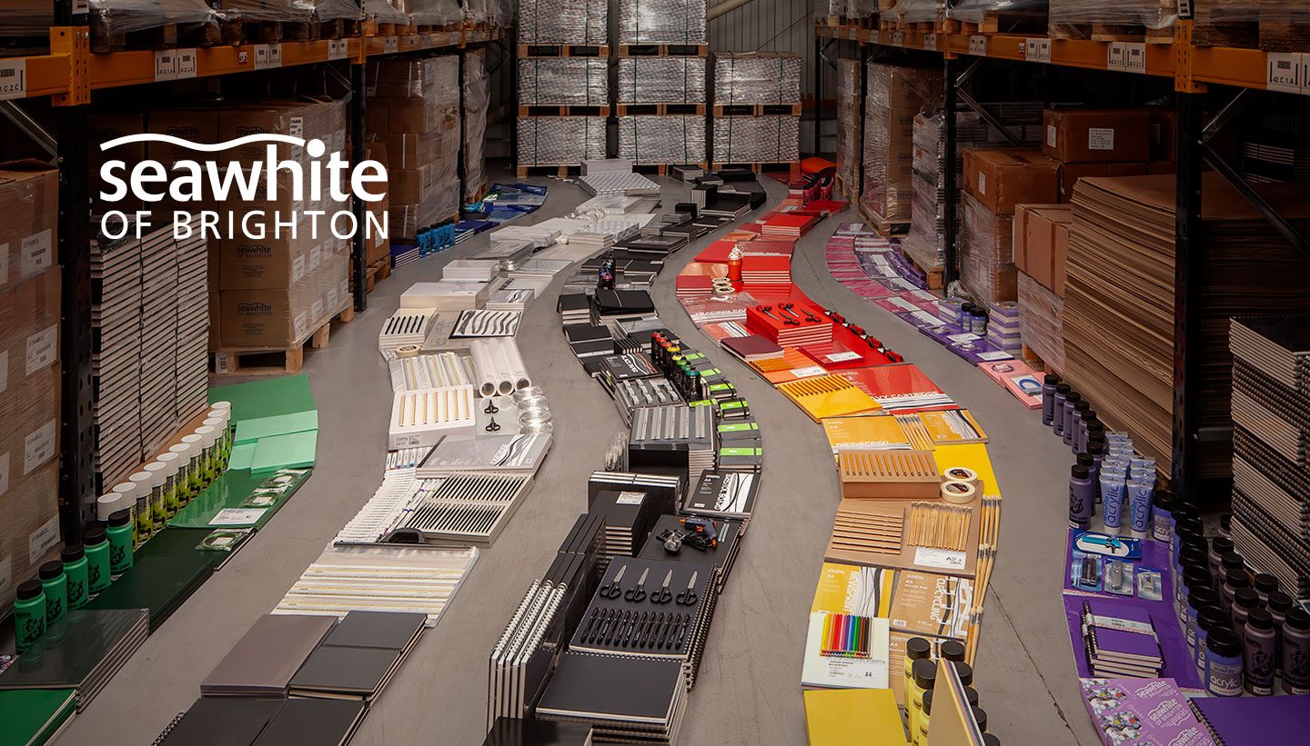
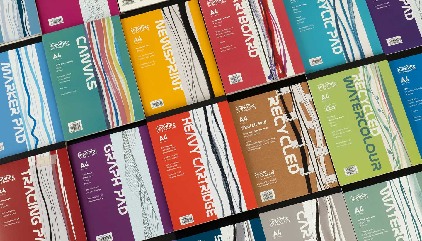
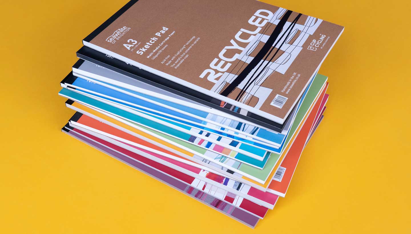
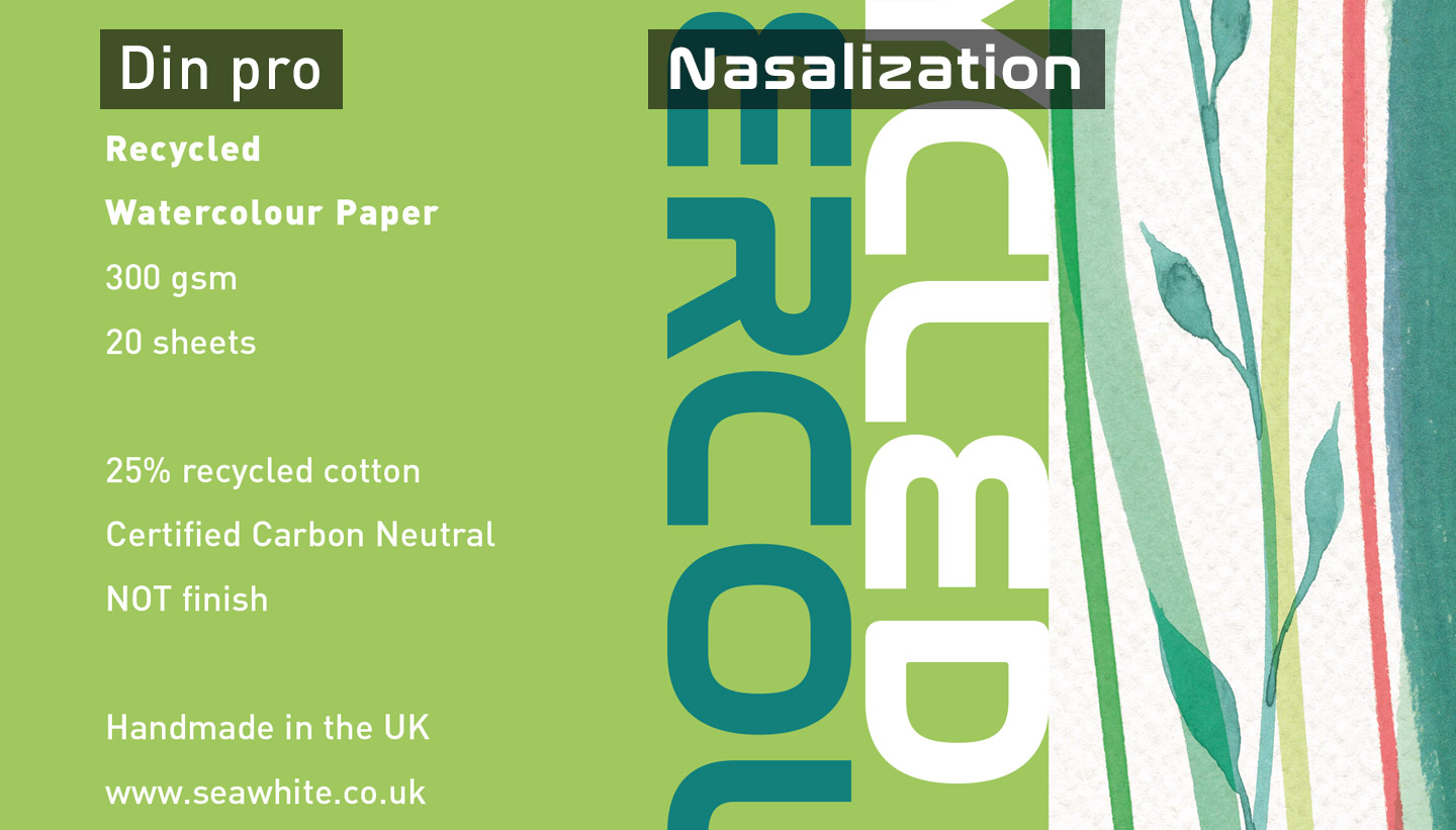
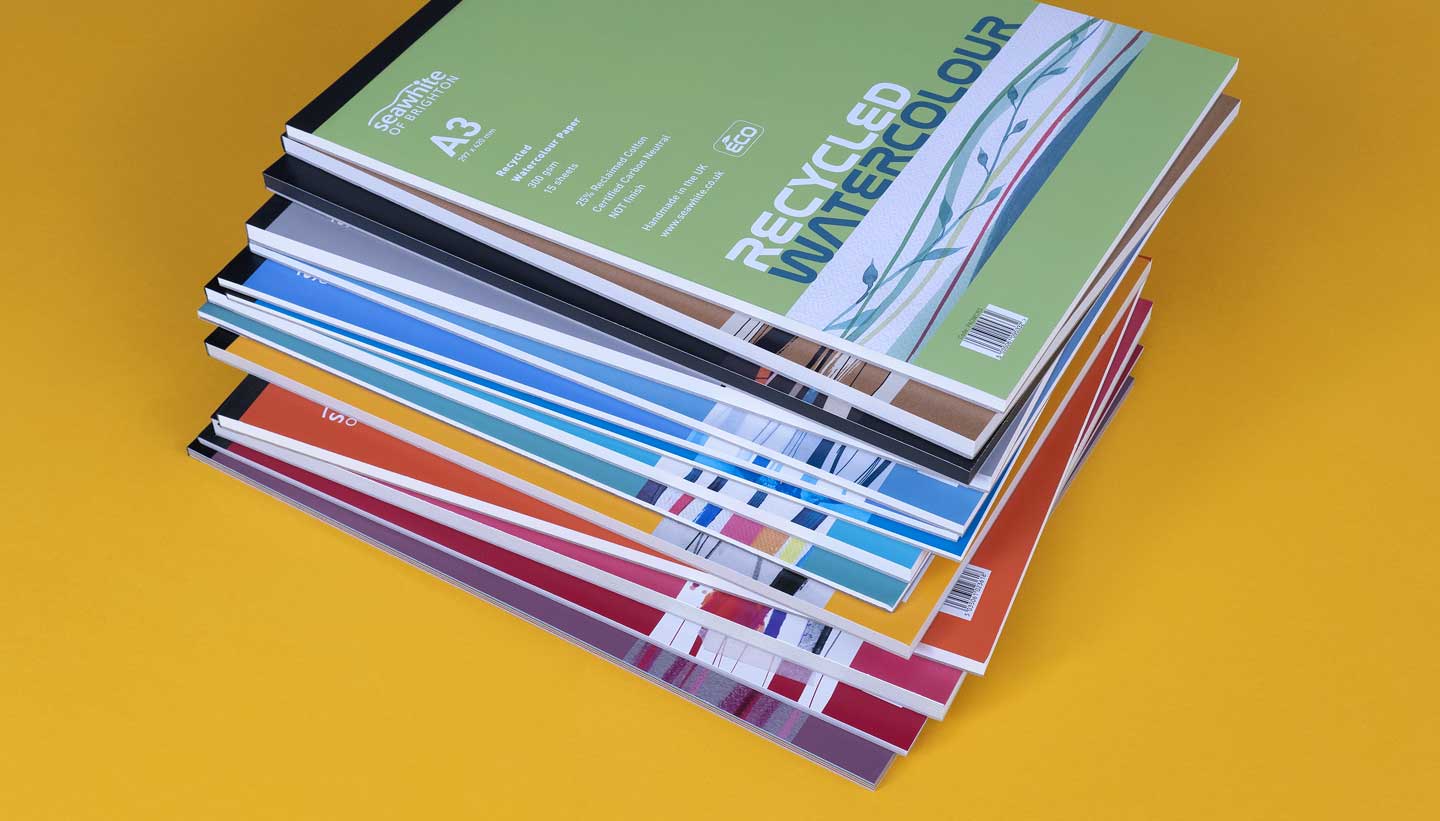
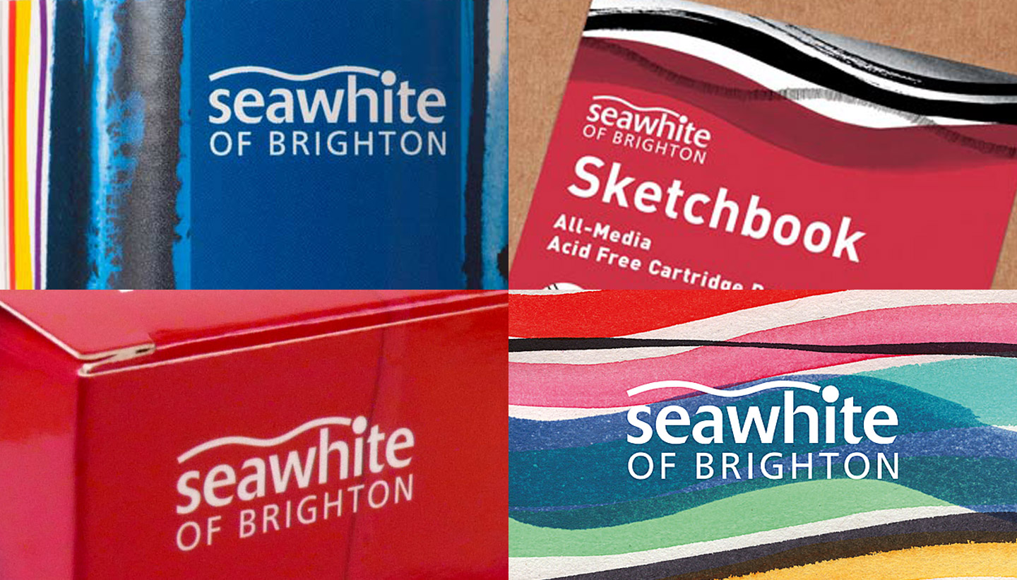
Seawhite of Brighton manufacture and supply art and design materials to education and retail worldwide. They remain a family-run business, now with a 50+ strong workforce. They are based in Partridge Green, West Sussex, not far from Brighton where the business began. We have been working with Seawhite on branding and packaging design projects for over twenty years. Our first design project was to create a branded cover for their cartridge sketch pads. Eventually, we went on to design covers for the rest of their art pad range. As a result, Seawhite’s pad sales rose significantly. In the years that followed, we have been commissioned many times to design packaging for a huge range of Seawhite art materials. Examples include acrylic paints, drawing pencils, inks, canvases, markers and picture frames. From the start, we wanted to set up a recognisable house style for Seawhite packaging. Here are some of the elements we considered: We introduced the sans-serif typeface Din for its great legibility. Din is now the ‘house font’ for Seawhite product packaging. In addition, we chose a font called Nasalization as a title font for the pad range. Nasalization, with its 1970’s NASA logo vibe, adds to the unique character of the range. Seawhite Typography We have a flexible approach to colour for Seawhite, given the huge range of products they sell. At the same time, for certain product types, we have embedded specific colour palettes. For example, with the pad range, each type of paper is represented by a different eye-catching colour. This helps to distinguish the products from each other in a retail environment. The colour Blue remains the primary brand colour for Seawhite (see the latest blue on their website header). Seawhite Art Pads – Toop Studio The Seawhite logo was established before our time. Previously, it was more commonly used in its 2-colour (blue and black) form. We made the move early on to set it in all-white or all-black wherever possible. This gives the logo a cleaner simplicity which works well on all the different colours used in their packaging. The Seawhite logo We wanted to create a different piece of abstract artwork for each cover in the appropriate medium for each type of paper. The thinking behind this was, it would help to give every product its own character. Our solution was ‘the wave graphic’. The idea of using waveforms originally comes from the wavy line in their logo. This wavy line represents the sea (specifically, in Brighton, the city the company was founded in). Most of the products we have designed for Seawhite contain a version of this wave graphic. The Seawhite ‘wave graphic’ ‘Seawhite competes against the biggest companies in the graphic arts industry and we feel that we have been fortunate to have found a designer who manages to hit the target so effectively. We find Toop Studio easy, pleasant and economical to deal with and the results have helped strengthen our brand.’ Nick Tobin ‘Shadric’s creativity, eye for detail and branding skills are second to none.’ Natalie Tobin
The art pad range is Seawhite’s best seller.Seawhite Art Materials – Product Branding & Packaging Design
Seawhite Art Materials – Packaging Design
Background
Seawhite Art Materials – Our packaging designs
Typography
Colours
Logo
Wave graphic

Client’s Response
Marketing Director, Seawhite
Marketing, Seawhite
Seawhite Art Materials – Product Branding & Packaging Design
