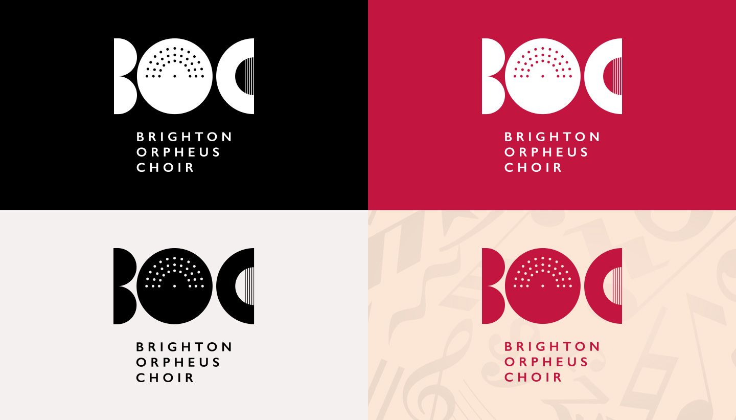
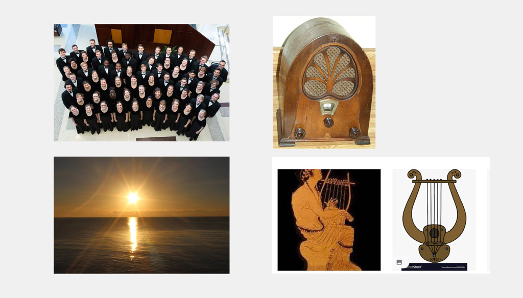
The Brighton Orpheus Choir was founded in 1942 (originally named the Withdean Choral Society). The name was changed to the Brighton Orpheus Choir in 1954, Orpheus being the musician and poet of Greek Mythology taught to play the lyre by Apollo. Over its 80-year history, the choir has built an enviable reputation based on performances of the classical choral repertoire, whilst also exploring the work of contemporary composers. The choir is now under the directorship of Nicholas Houghton. It continues to attract members from all over Brighton and Hove and as far away as Shoreham and Lewes. BOC performs three major concerts a year with professional soloists and orchestras. Brighton Orpheus Choir (BOC) commissioned their rebrand in 2022. The brief for the new logo was primarily to modernise BOC’s image. It had to have a subtle reference to music while retaining some essence of the previous logo and the heritage of the choir. We explored several routes before settling on the final design. The favoured design was a modern typographical approach, that incorporated a couple of coded visual elements. The logo concept Firstly, inside the ‘O’, is a series of dots that represent a choir as seen from above, with a conductor in the middle. There is a double-reading of this element – it also represents a shining sun, making a subtle connection to the friendly, progressive city of Brighton & Hove (more in terms of attitude than the weather!) Secondly, the ‘C’ contains a set of ‘strings’, turning this shape into an abstracted lyre (as seen from the side), which makes a connection back to the original lyre in the 1954 logo. Brighton Orpheus Choir Logo – before and after comparison – Toop Studio rebrand ‘From the first conversation to the ultimate design, Shadric was professional, highly creative and excellent at describing the thought processes. I recommend him very highly.’ Hilary BrownBrighton Orpheus Choir Logo


Brighton Orpheus Choir Logo Design
Background
The Design Brief
The Outcome


Client Testimonial
Chair of Brighton Orpheus Choir