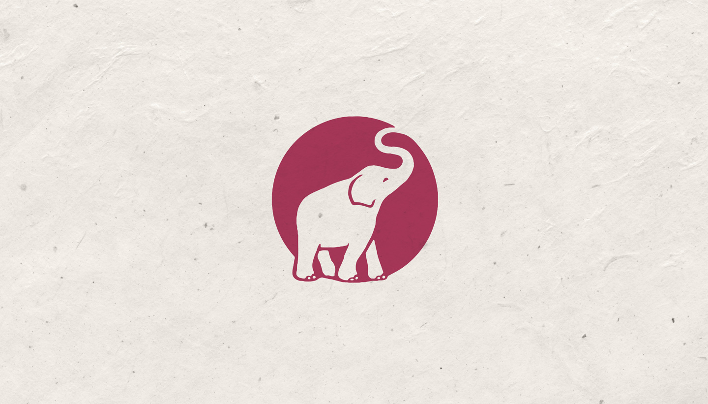
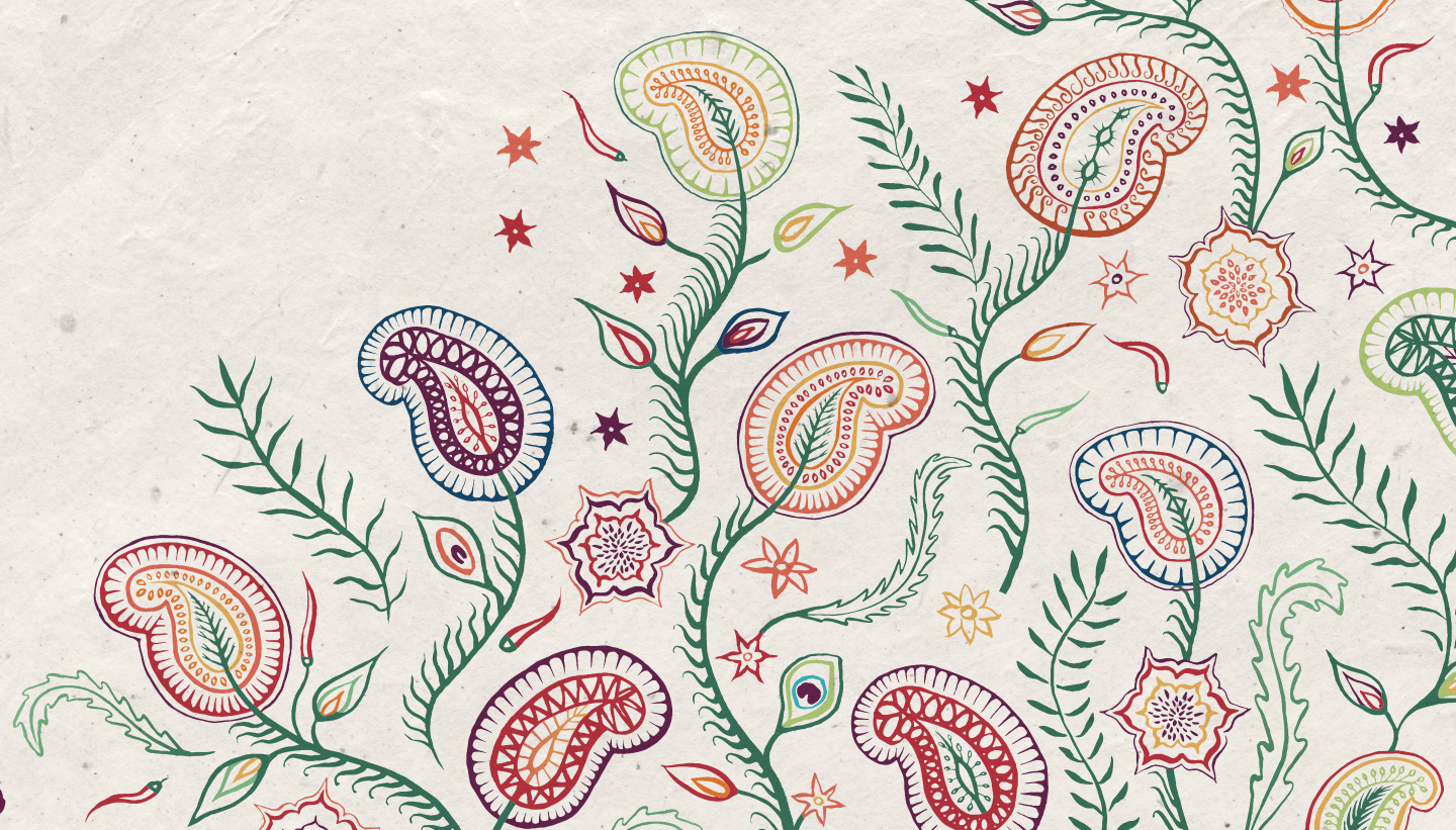
Trading Boundaries is a distinctive retail destination nestled in the East Sussex countryside, specialising in antique Indian furniture and handicrafts. The venue also houses a licensed café, a fine art gallery featuring the work of album cover artist Roger Dean, and transforms into a live music venue in the evenings. In addition to these, Trading Boundaries now operates a boutique hotel and offers its stunning location as a wedding venue for hire. Toop Studio was commissioned to completely refresh their branding, including a new logo, typography, and colour palette. The challenge was to create a cohesive identity that would unite the diverse aspects of the business. The new wordmark draws inspiration from Trading Boundaries’ core offerings—colonial-era Indian furniture—and aligns with their future boutique hotel, which will be located in 18th-century stables. The elephant logo, a long-standing part of the brand, was reimagined to blend nostalgia with a contemporary feel. We took cues from Victorian branding while crafting a dynamic and playful pose for the elephant. Its circular form ensures versatility, working well across all sizes, including small-scale uses like browser favicons. The colour palette reflects the vibrant hues found in their showroom products and the Indian region where most of their suppliers are based. We selected warm dusty pink, vintage cream, and charcoal grey as the core colours. To complement this, we created textured backgrounds and a bespoke Indian-inspired illustrated pattern to enhance the brand’s identity. ‘The new logo, colours and assets are working really well and we’ve received really positive feedback.’ Jenny Ross PR & Marketing Manager, Trading BoundariesBranding Design: Trading Boundaries


Branding for Trading Boundaries
The Brief
The Outcome
The Client’s Response

