A Look at Our Brighton Logo Designs
As a Brighton-born graphic designer, I’m proud to have shaped the branding of local businesses and institutions over the past 25 years. Here’s a look at some of my logo and branding projects many of which are still visible around the city today.
Varndean School – A Logo Design for a Brighton Institution
![]()
![]()
On the Left: Varndean School Logo c. 1926 | On the Right: A commemorative 100 Year badge designed by Toop Studio
In 2012 I was commissioned by the then headteacher Mr Deighan to rebrand Varndean School. Varndean is one of Brighton’s oldest state-run high schools and was founded in 1884. Throughout its history, the branding has been centred around dolphins, a motif derived from the Brighton & Hove Crest. For their new logo, I featured four dolphins leaping forward together, symbolising the four smaller schools introduced by Mr Deighan.
In 2021, Ms Baker, the current headteacher, commissioned a tweak to the logo to reflect the shift from four smaller schools to five. In 2026, as the school celebrates 100 years since moving from central Brighton to its current site, I was commissioned to create a new anniversary logo inspired by the original 1926 design.
Read more about the Varndean rebrand.
Bert’s Homestore – a Brand Refresh for One of Brighton’s Iconic Retailers
![]()
![]()
The Bert’s Bag was designed by Toop Studio in 2015
Bert’s Homestore, a well-known independent chain in Brighton & Hove, commissioned me in 2015 to refresh their brand. I started by simplifying their logo for better visibility on social media, introduced the strapline ‘Fabulous Things,’ and created a hand-painted version of the logo along with a new website.
One of my favourite parts of their rebrand is the paper bags, still in use ten years on. I spot them all over town—a testament to how much shoppers love Bert’s.
Read more about the Bert’s rebrand
Hotel Una – A logo for one of Brighton’s most popular hotels
![]()
![]()
![]()
In 2006, Hotel Una commissioned us to design their logo. Named after the River Una—one of Europe’s hidden gems—the hotel wanted a brand identity that reflected its boutique charm and sense of exclusivity.
The logo takes inspiration from the natural flow of water, using fluid lines to echo the hotel’s emphasis on organic materials and understated elegance. Designed to be timeless, the logo has remained a core part of Hotel Una’s identity, even as their website and interiors have evolved over the years.
Find out more about the Hotel Una Project
The Granville Hotel – A logo for a former Brighton Seafront Hotel
![]()
![]()
The Granville Hotel, located at 123-124 Kings Road, commissioned us to rebrand their seafront boutique hotel in the noughties. They also opened Dadu, a basement restaurant that served breakfast for hotel guests and transformed into an Asian restaurant in the evening. Unfortunately, the hotel closed its doors in 2020.
Read more about the Granville Hotel rebrand
Smokeys – A logo for an American BBQ Restaurant in Brighton
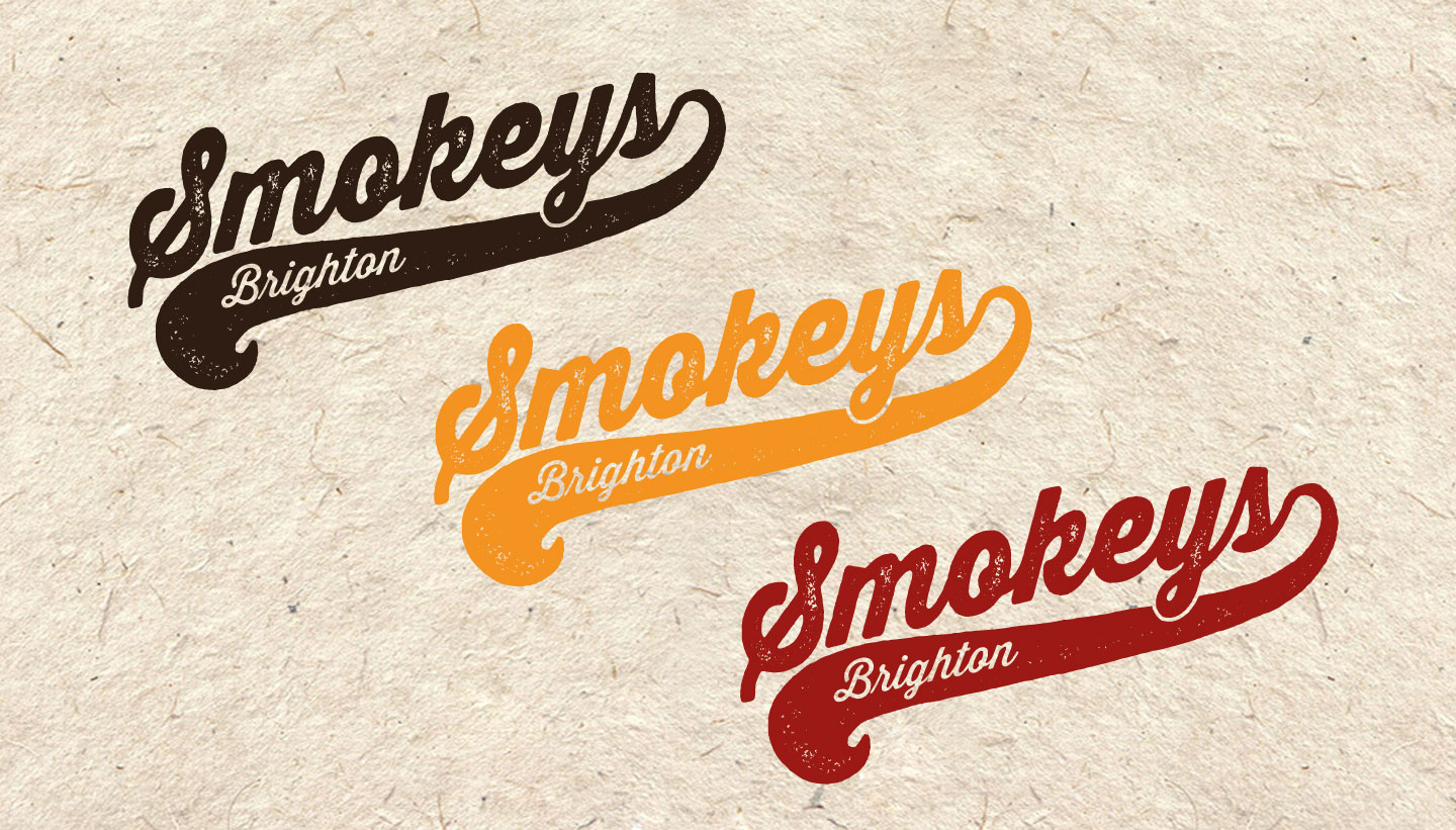
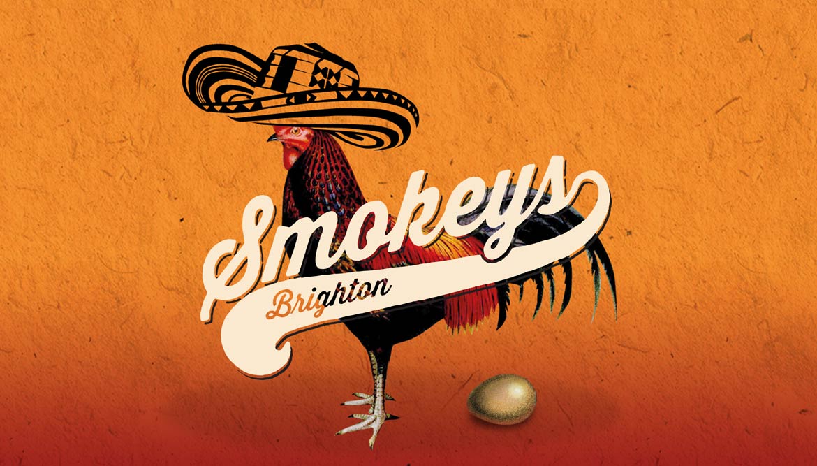
In 2013, the owners of the Granville Hotel (see above) set up a new restaurant serving American BBQ. We were commissioned to come up with a name (we went with ‘Smokeys’), along with a new logo, signage, and menu. Smokeys was a success for years—I dined there a couple of times myself.
Find out more about the Smokeys project
All Saints Hove – A Logo for a Church and Music Venue
![]()
![]()

All Saints Church Hove – Logo on the door (left) and Trinity Window (right)
This was an interesting commission for one of Brighton and Hove’s most impressive churches: All Saints on The Drive, Hove. Built in the thirteenth-century French Gothic style, it’s a Grade I listed building made from Sussex sandstone, with notable stained glass and intricate carvings. The logo we designed was inspired by their iconic ‘Trinity Windows.’
Yellow Fish – A Logo That Launched a Lasting Business
Brighton Logo Design – Yellow Fish – The Original Logo circa 2004 – Toop Studio
![]()
In 2004, I designed the original logo and launch materials for a Brighton-based events company called Yellow Fish. This simple logo was structured around a subtle ‘Y’ integrated into the tail. Since then, the company has undergone several rebrands, none of which I was involved in, but the original logo remains a memorable part of their journey.
Go to the Yellow Fish branding project
Brighton Orpheus Choir – a Logo for a Choir founded in 1942
![]()
Brighton Orpheus Choir Logo – before and after comparison – Toop Studio
In 2022, Brighton Orpheus Choir commissioned a rebrand to modernise their logo while retaining ties to their heritage. The new design features a typographic approach with subtle musical references: the ‘O’ symbolises a choir with a conductor at the centre, and the ‘C’ incorporates abstract lyre strings, referencing the choir’s history and their previous 1954 logo.
Read more about the Brighton Orpheus Choir rebrand
Trading Boundaries – A Logo for an Eclectic Sussex Business
![]()
![]()
For our final project, we’re heading a little further afield to Trading Boundaries near Sheffield Park in East Sussex. The company, known for its antique Indian furniture, had us refresh their branding in 2020. The elephant, a long-standing symbol, was reworked to give it a more modern and playful feel. The new wordmark reflects the showroom’s colonial-era furniture, while the colour palette draws from the vibrant hues of their products. The updated identity helps unify the business’s diverse offerings, from the showroom to their new boutique hotel and wedding venue.