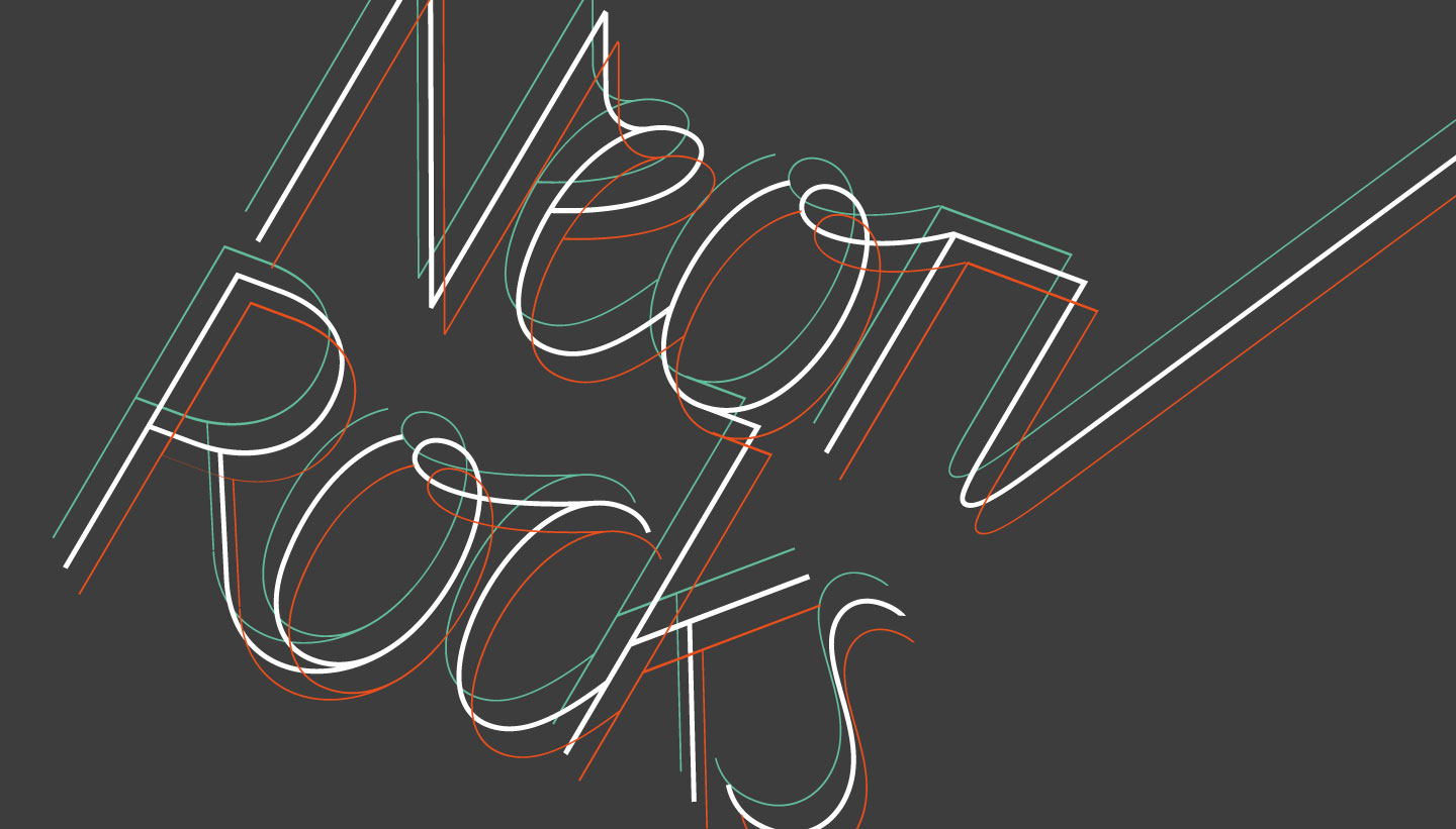
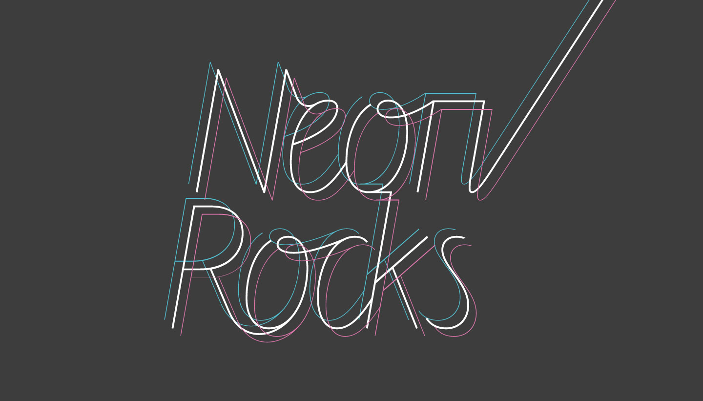
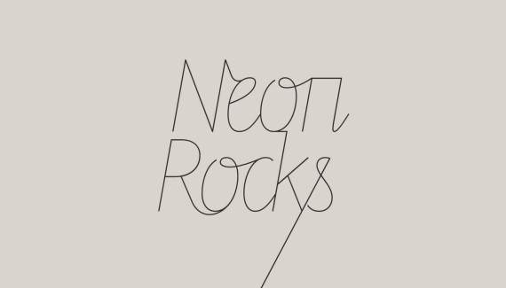
Neon Rocks is a Brighton-based PR agency with strong contacts across the beauty, health, hair, fashion and lifestyle industries. We were briefed to design their new logo. With a name like Neon Rocks, we wanted to keep the solution simple and typographical, but with a nod to the ‘neon’ theme. We chose to work with a the typeface Line from foundry Letters from Sweden, because of its interesting combination of calligraphic connected letters and square shapes. We then connected up all the unconnected letters to create a logo that you could ‘flow electricity through’ (if you wanted to). We visually introduced the idea that the logo (and hence the company) is fully connected to the rest of the world via a ‘tail’ that extends from one of the letters, creating several variations for use. Inspired by a classic book/DVD cover for The Shock of the New by Robert Hughes, we also created an edgier ‘triple line’ version for display use, which hints at a ‘neon glow’ and creates a visual ‘buzz’. Neon RocksLogo Design – Neon Rocks PR
Logo Design – Neon Rocks PR
The Brief
Our Design
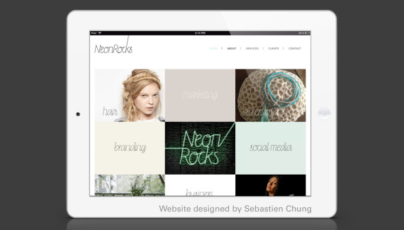
Website designed by Sebastien Chung


